You Don’t Just Need a Website. You Need a BUSINESS WEBSITE
HAND-CRAFTED BUSINESS WEBSITES
BUSINESS websites by graphlink
We partner with IBM Gold Line Servers.
Ensuring business-level reliability.
ON THIS PAGE: Business Website Design / Interactive Web / Point of Purchase (POP)
BUSINESS WEBSITES: There’s a Difference.
You aren’t a “blogger”, and you don’t share crab cake recipes. This isn't whimsy.
You are a business person who needs a website for serious business marketing and sales.
As a business person, it should be obvious.
The people you want to develop your business website should be an experienced marketing firm with a track record of successes. A team that takes the time to understand your business, it’s target markets, and its long-range objectives. A team that can work with you on branding, marketing, and making you more money.
Graphlink has been such a company for over a quarter century. We sit down with our clients in face-to-face meetings (in person or in video chats). We help clients identify their Unique Selling Proposal (USP), and find the best ways to communicate it to your potential markets. Then we translate that to the website and other communications we create for your brand.
We have produced award-winning custom websites and online marketing campaigns for big-brands like American Express, Trojan Brand Condoms, The NY Metropolitan Transportation Authority (MTA). eCommerce elements for etronics.com (at the time the 3rd largest electronics dealer on the web), Lincoln Center’s online gift shop and other marketing, and a host of small to medium sized businesses and restaurants.
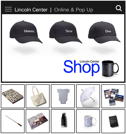
We are proud to have worked with Lincoln Center, producing website
elements and overall marketing campaigns for quite a few years.
Websites by Graphlink Own Your Market
FREE DOWNLOAD of our PDF "Website Checklist: 5 Essentials"
⇨
CLICK HERE
Website Checklist:
5 Essentials
FREE. Download PDF Now.
(We don't share or spam. Just a few emails per year.)

CLICK TO CLOSE WINDOW
One Million Downloads
During the early days of the internet, Graphlink designed one of the first mega-downloads, the Trojan Condom Screen Saver. Becoming part of the "First 100" Club.
A Streaming Success
Graphlink Media helped launch Wall Street's MONEY.NET, and expanded American Express market share.
We created cutting edge streaming ads, marketing and educational material for both companies.
Interactive Education
Graphlink is a pioneer in online education, winning awards including the select inclusion in the venerable Electronics Publishing Magazine's TOP 20 PUBLISHERS AWARDS.
A Unique Partnership
Our work has frequently been touted by our friends at Adobe. They have regularly quoted and praised our work, designs and educational efforts in the industry.
Awards & Accolades
websites by graphlink
SAMPLES

An Independent Success
In the Ultra Competitive world of NYC fitness
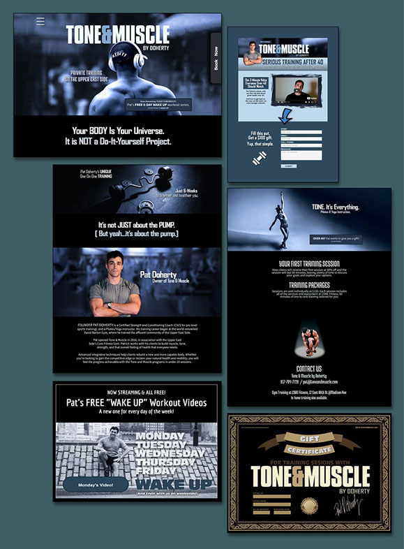
Former celeb trainer at David Barton Gym, Pat Doherty left to open Pat Fitness in 2015. He had a great Upper East Side location off Madison Ave., but no branding to attract former clients.
In 2018 he engaged Graphlink to overhaul his company image. We re-named his fitness company to Tone & Muscle, trashed the stock website that had failed him, and designed the hot website you see here. Existing clients went "WOW!" New clients came, and bookings sky-rocketed.
We engineered this to be a "working website", with easy appointment bookings, free promotional workout videos that automatically changed daily, stunning gift certificates, and more.
- Adding a simple BOOK NOW tab increased session bookings in just 3 weeks.
- Most clients are always on the run, so this was a true "mobile first" design, with all functionality available from phone.
- Two markets were identified and targeted. The well heeled over 40 Madison Ave. set, and a younger demographic a few blocks east.
- Customized landing pages helped convert visitors into returning clients.
At Graphlink, we developed the idea to produce a "Wake-Up Workout" video for every day of the week. And share it, for free, on the website. For current clients, and potential clients.
This created a powerful viral marketing campaign that spread, helping both in-person clients, and later with virtual training.
"Great website. My clients are loving it,
and I'm getting WAY more bookings!"
— Pat Doherty, Owner Tone & Muscle, NY
This super-sexy website attracted his target market.
And the headlines we wrote sent the perfect message.
RESULTING SUCCESS
Within weeks, the new website and its
booking button increased training sessions by over 300%. Out-pacing all expectations.
The Classic NY Diner
Update for a new world or risk perish.
A little history: For those that know it, the Sutton Cafe has been a staple of the Sutton Place area for nearly 40 years. And for those old enough, it was originally a "Soup Burg", which was a very popular franchise at one time. (The last one closed in 2014, after a 56 year run.)
Similarly, Sutton Cafe was in deep need of modernization and needed to speak to a younger audience. Graphlink's Food Media division was brought in to revamp the entire brand.
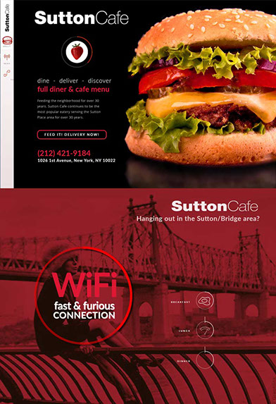
We standardized their name (they went by Sutton Cafe, or Diner, or Restaurant. It was a mess). We created a clean new logo. And we installed a fast and affordable online ordering system.
We also designed the website you see here. With strong graphics, mouth-watering food photography, easy to order online services. And an open invitation to come in, have a coffee and surf.
As markets change, even long-time success stories have to stay competitive or risk becoming valueless.
With Le Pain Quotidien chain opening literally next door, and other diners within a block, Sutton's market was quickly being eaten away.
Unfortunately many longtime business owners (large and small) do not want to see this. Until it becomes to late.
Our branding and designs cut through the competition, even Quotidien, and offered a unique product, and style. As seen in the website.
Please Visit More of Our Food Marketing
at Our Food Media Website.
www.FoodMediaNY.com
If nothing else, every food business needs not good, but AMAZING food photography. It needs to be what they call "FOOD PORN", and needs to make your mouth water.
Graphlink photographed their entire menu, in a way to make every Yelper and Seamless customer drool.
RESULTING SUCCESS
Marketing is a partnership. Marketing makes the promise, and the company MUST deliver on that promise. Alas, Sutton did not, and remains to this day, essentially the last Soup Burg, stuck in 1976. Though we resigned the account, we were proud of our efforts, the compelling branding and web-designs.

RESULTING SUCCESS
Manny's Optical opened into a VERY competitive market.
It was surrounded by a half dozen independent eyecare shops, and at least one very large franchise within 4-blocks.
Yet, with our help in web design and marketing, they have not only survived, but have thrived well past the magic 5-year mark.
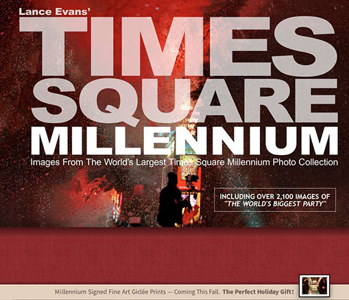
A collection of over 2,100 spectacular photographs of a once in a lifetime event: The Millennium in Times Square.
Once Every Millennium
A breathtaking photo-essay by Lance Evans.
In the fall of 1999, Lauren Schneider, the longtime Producer of the Times Square Ball Drop event, reached out to Lance to work with the The Times Square Alliance (formerly the Times Square Business Improvement District) on their monumental event: The Millennium.
That year was unique, unlike any before or since. Instead of a single celebration at midnight, there would be one every hour, to celebrate New Years with the entire world.
Lance was brought in to photograph the event. And despite it being shot by photographers from every media outlet, Lance's collection is by far the most comprehensive.
This website, TIMESSQUAREMILLENNIUM.COM is the site for future related books, art and documentary projects.
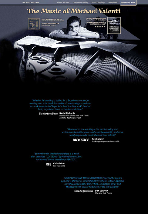
The website was designed around Mr. Valenti's favorite portrait, done by Lance Evans, sitting at his 100 year old Steinway Grand in his Manhattan living room.
Something of a Legend
Composer Michael Valenti.
He wrote the "Processional for the Pope", used for the entrance of the last three Pontiffs. He has written the score for multiple Broadway shows, off-Broadway, evenings of his work performed at Lincoln Center and by major orchestras around the world. He wrote the music for the Big Apple Circus for 10 years. And so much more.
We are very fortunate to have a multi-decades long working relationship with Mr. Valenti, working on a wide range of projects including producing some of his music, albums and other projects, co-creating projects together like "My Coloring Thing" and "My Magical Sheet Music" for kids, used by the NY Department of Education. And we published his autobiography that was named "Best New Autobiography" by Amazon.
We were pleased to produce his website, as well as the photo used for its cover (which was also used as the cover to one album).
RESULTING SUCCESS
The website has become a center for all of Mr. Valenti's work. An eCommerce site for selling albums, and to promote his shows.
RESULTING SUCCESS
For his own reasons, Bianchi was unable
to make continued use of our efforts, and instead remains a fringe theatrical force.
This, along with our success stories,
truly underscores how proper branding and marketing is needed with even the most wonderful of products.
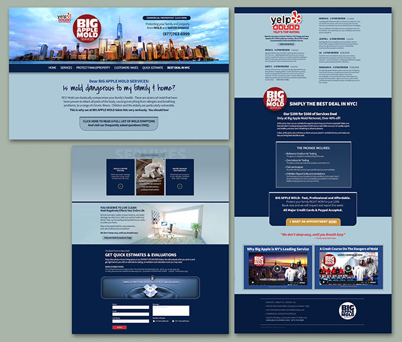
Shoppers want the information they need, quickly.
So designing a single page website is critical. But so is allowing for additional information on other pages.
It comes down to a delicate balancing act. One that can impact both long, and short term sales.
We made it so easy. A potential client brings up the website, then just drags & drops their photos onto our Dropbox style submission form. Done.
Big Apple Mold got the info they needed to get estimates out fast. And get new clients even faster.
Start Services Online
Sophisticated site for an age old service.
Big Apple Mold Service is a popular and successful mold inspection and remediation service across the New York and Tri-State areas.
With equal amounts of residential and commercial business, the owners acknowledged their need to grow fast, or get swallowed by the competition.
Graphlink was engaged to deliver on two fronts:
An attractive website that would appeal to both retail and wholesale business.
And develop a tech website that had all the added functionality their business needed. Like being able to collect instant remediation data from customers. Like an easy to use Dropbox -style interface.
This allowed Big Apple Mold to respond with estimates, much faster than their competition.
RESULTING SUCCESS
Their old website was crawling with MOLD. And nobody was buying. We explained that nobody wants to buy mold. They want to buy the CLEAN.
We taught them that you have to sell what people want.
Not what people are trying to get rid of.
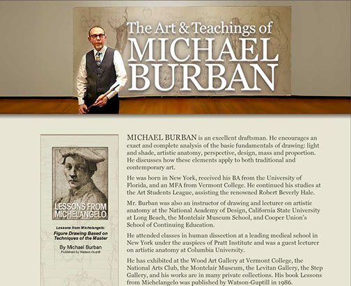
The Fine Art of Fine Arts
A platform for the good Professor Burban.
Professor Michael Burban has been the internationally acclaimed art-anatomy lecturer for over 30 years. Teaching at the world famous
Art Student's League of New York, and other top art institutes in New York, and other major cities.
He had many web "pages" on art school websites, and at representing art galleries. But there was no single location for his ardent followers to find all of his information, about classes and showings.
Professor Burban's lecture series at the Art Student's League is something of an art-world classic. But the League's art gallery space it is held in is 150 years old. So we had to do some special photocomping to make this header image as nice as it is.
Much of what Professor Burban teaches is in his book, published by Watson-Guptil. Which we features on his site.
"My student's loved the site. And it is allowing them to refer my classes, and find new students."
— Professor Michael Burban
The Art Student's League of NY
"You've hit this project out of the
ballpark. Again. Thanks!"
— Steve Harford, CEO BUILDFLOW, NY
With our stylish spin on corporate web-design,
note how we created a header that is also an introductory video, on this sophisticated one-page landing promo.
A Mid-Sized Success Story
We Helped a Once-Small Company, Become a Market Leader
BuildFlow is a very successful construction services firm in midtown Manhattan, with huge ground-level offices off 5th Ave., near Grand Central.
But when we were first brought in to help grow their firm in 2005, they were a much smaller company off 12th ave. Graphlink went on to re-name and brand their company and products. We created the "BuildFlow" name, and they've been our clients ever since.
Brought back to do it again for their new "CloseOut" products, we developed this beautiful landing page and videos that clearly and quickly communicate CloseOut's unique value to customers like NYU Langone, Tishman Construction, Hunter-Roberts.
Features / benefits are designed to be easily understood, and be visual eye-candy.
- Elegantly sliding panels & navigation
- Slide-show for product benefits
- Roll-over pop ups show features
- A Call-to-Action in the floating header
- Beautiful PDF Fact-Sheet download
We cast the 3 actors, and shot the videos in our midtown studios.
All videos were on green screen with effects added in post-production.
While the static images here can't capture the effect of the animations we created, they were both subtle, as in the lines of the homepage. And strongly graphic, like the sub-pages.
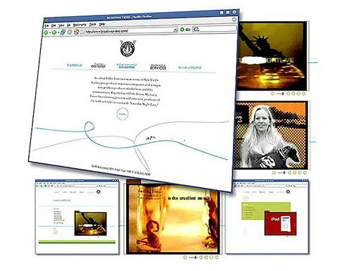
SNL's Broadway Video
Lorne Michaels' Saturday Night Live
Graphlink was fortunate to work with Lorne Michaels and team on a number of projects, including launching one of the websites.
It's goal was to brand and market a number of their television efforts, and it helped sell a number of projects to both broadcast and cable networks.
Our website work included a number of multimedia and animation efforts, and many strong graphics.
Theatrical Aural Magic
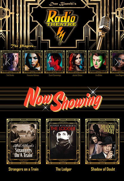
Bianchi's RADIO THEATER
For nearly two decades, Dan Bianchi has been producing some of the most innovative theater in NYC.
His "Radio Theater" stage shows bring back the days of old radio. The stories, the drama, the humor and the excitement that our parents and grandparents felt from LISTENING to the story, rather than watching it.
Our designs for his theater company website reflected the style and glamour of the eras that his theater brings back to life. Highlighting the vintage microphone, alongside the ornate details of those great theaters.
To paraphrase Mies van der Rohe, client conversion lay in the details. For it is the sophistication of your business website's design, that a potential client will gauge your own sophistication.
Doubt this at your own risk. Measure it, with the bank receipts you gain or lose from doing things right.
"Your web design created just the image my firm needed to reach our market."
— Mabel Bejar, NY Licensed Attorney
Professional Website Style
Professionals generally do not have a retail store, they have an office. So a website is usually the one and only opportunity to communicate many important messages to potential clients, and even existing ones.
Whether a medical or legal practice, there will be facts that need to be communicated. What schools did you go to? What are your specialties, and strengths?
But, what will set your practice apart?
People buy based on how you make them FEEL. People like facts, but they make decisions on a gut level. Especially when it comes to who they TRUST. It's what our Ben Colarossi called "HeartSell".
A thoughtful, well designed, and well executed website creates trust. And that creates more clients.
The Retail Experience
Today's retail experience starts online.
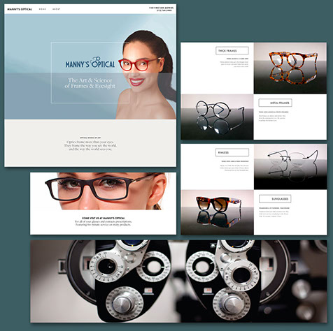
Some professionals, like this Manhattan eyewear store, have retail establishments that need a great website to draw customer in. Otherwise, they'll just go elsewhere.
Customers do their shopping online, before they do it with their feet. So your online brand will be the determining factor if customers ever show up in person.
This particular eyewear and eyecare store, on Manhattan's Upper East Side, is located in the bustling "Bridge Market" area, opposite Bed Bath & Beyond, TJ Maxx, Food Emporium and others, under the 59th street Bridge.
Manny's Optical not only sold eyewear, but also has their own line of custom designed glasses.
Graphlink photographed the entire line, as seen on their website, and helped with its marketing.
A Revival of Style
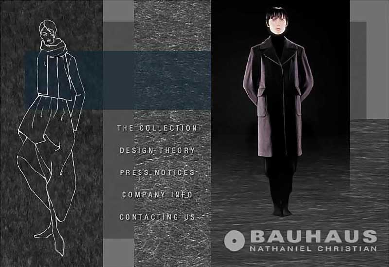
Style begets style, at Atelier BAUHAUS.
When we met Nathaniel Christian, owner and lead designer at BAUHAUS Fashions, one thing struck us: His love of texture! All kinds. He had retro fabrics handmade. He had metal clothing, made from custom woven fabrics spun from stainless steel.
We were bowled over.
His website had to match, and reflect his own creatively. This was not an easy thing to do some years back when we designed this site. But we captured the feeling of his style, and a few creative awards at the time as well. It was a site we liked very much.
Texture, texture everywhere! A lush site that was quite unheard of when we launched it in the mid 2000's.
Using Flash at the time, the panels slid out, sequentially revealing different items of the new collection.
RESULTING SUCCESS
Launch of this service and marketing netted both industry buzz, and a multi-million dollar project from NYU Langone Health.
RESULTING SUCCESS
The shows that were features on the website went on to become series and specials on various networks, earning millions.
RESULTING SUCCESS
"Stunning" was a word new clients used to describe the website. Said another:
"Seeing your website told me you
were the lawyer I needed to work with.
It just spoke to all of my wants."
The right website, makes a difference.

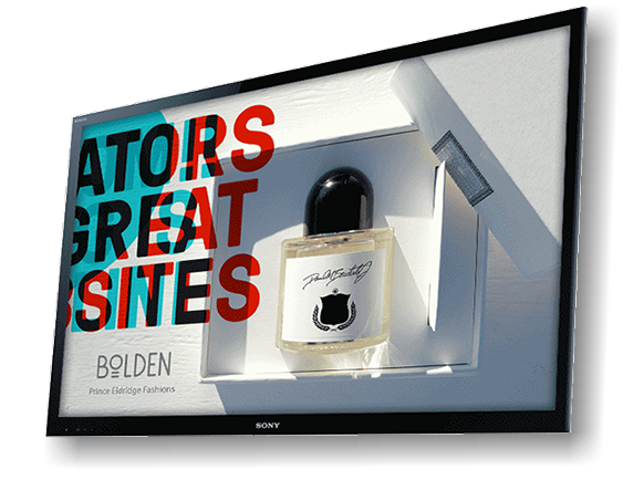
POINT OF SALE DISPLAYS!
Interactive and video displays deliver more sales to your business.
Here's why:
- They capture attention on the street
- They engage, entertain and inform
- They sell better than sales teams
- They can take a credit card order
ANIMATED MENUS & BRAND-BUILDING VIDEO DISPLAYS
THIS IS AN EASY WAY TO ENHANCE BRANDS AND BOOST SALES!
The web is more than just websites!
INTERACTIVE AND ENGAGING WEB-APPS & WEB-ADS
Graphlink: Interactive Pioneers
It was the 1980s, with big awards, clients & hair
Graphlink team members have been developing and rolling out top-flight digital interactive projects since the 1980s.
We began with kiosk designs for groups like Chase Manhattan Bank, and BMW Cars. Then moved on to help create the world famous American Express Multimedia Team located in the World Financial Center in NYC, the global headquarters of American Express.
We then created one of the net's first MILLION DOWNLOAD successes, the Trojan Condom Screen Saver.
After winning awards for both AMEX and Trojan Brands, we helped launch the Wall Street juggernaut MONEY.NET, with our smashingly successful "ScreamerNet" promotions.
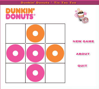
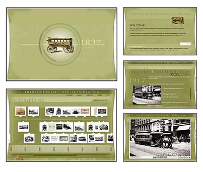
Over the years we also produced interactive web-applications for Dunkin' Donuts, The Metropolitan Transportation Authority (MTA) Museum website, Cross Pens web-ads, numerous Broadway shows, and other clients.


Graphlink's entire creative team was brought in to help launch the famous AMEX Multimedia Lab in NYC.
Top-right: MONEY.NET's award-winning "ScreamerNET" promo.
Bottom-right: Metropolitan Transportation Authority Museum
Below: Dunkin' Donut's Tic-Tac-Toe online game.

Located in
Midtown Manhattan
Take the First Step: Say Hello Now

Located in
Midtown Manhattan
Health Marketing
Industry Education
Terms of Service
LEARN MORE: SUB-PAGES...
Web Design Samples
Our Creative Services
Additional Samples
OUR OTHER BRANDS & SERVICES
BLITZ.promo / SMB Online Marketing Service
FOOD Media / Food+Hospitality Marketing
MediaBook Press / Publishing Services
Lance Evans Photo / High-End Portraits
NY Ad Men / Marketing EDU on YouTube (WIP)
CLIENT DASHBOARD ACCESS
HOMEPAGE OVERVIEWS
About GRAPHLINK
Work Samples
Key Staff
BLITZ Marketing
CONTACT US
x
© GRAPHLINK MEDIA 2022